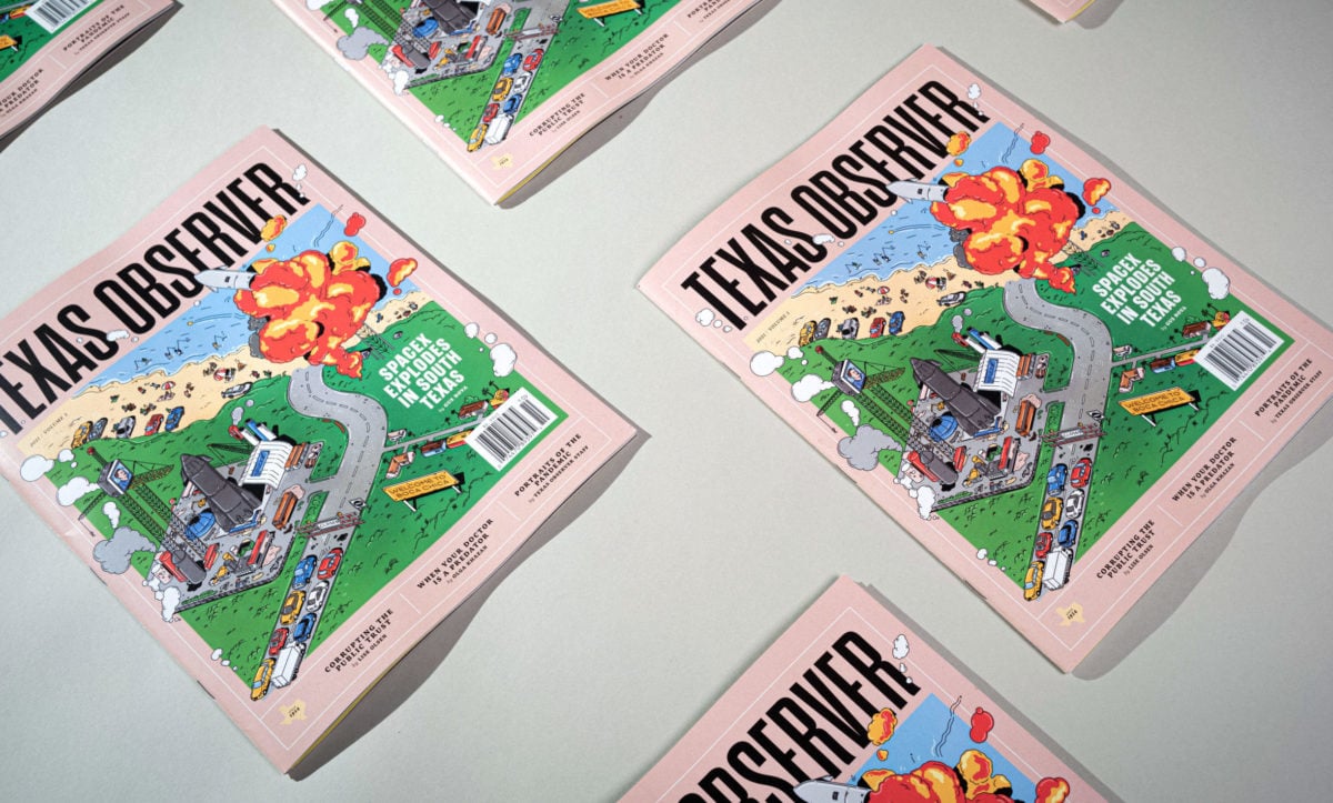
The Texas Observer, the state’s original reader-supported nonprofit newsroom, today marks its next iteration with a redesigned and reimagined new website, informed by its print redesign this summer—our first in over a decade. Led by art director Michael Patti and digital editor Danielle Lopez, under the guidance of editor-in-chief Tristan Ahtone and with the support of CMYK, the dual redesigns double down on our commitment to investigative, longform journalism and narrative storytelling.
Observer editor-in-chief Tristan Ahtone introduces the new site with an editor’s note today:
“We’ve moved away from the scrappy journal vibe that the Observer was known for in the past. Today, we think of our work as a tool that allows us to interrogate the origins of policies, correct narratives that whitewash exploitation and genocide, and think critically about the idea of Texas, its roots, and its influence. Our staff has worked tirelessly to bring you a website that looks and feels like our print edition, and provides an entirely new experience to enjoy the work of our reporters.”
“I’m so excited to be a part of the Observer‘s next era, and I’m thrilled to share this beautiful website we’ve built,” adds digital editor Danielle Lopez. “It has been a labor of love, and a collective, collaborative effort a year in the making. We can’t wait to hear what y’all think! Tweet us @TexasObserver or write us at [email protected].”
In print, the new Texas Observer brings readers nearly 15% more pages and eliminates advertising.
That’s more room for high-impact investigative stories. More narrative storytelling. More diverse Texan voices. And a more substantial product, with paper stock going up over half a poundage. Every page is rich with texture, intentionally increased white space for a more pleasurable reading experience, and a modular, flexible grid system that allows the print page to adapt to the needs of each piece.
The new look also features a new logo and a contemporary color scheme with a more muted palette, signaling a modern look that is at once more artful, less commercial, and more attuned to a journal committed to ambitious ideas and projects.
“My first goal was to be respectful,” adds art director Michael Patti. “If I couldn’t do something that was authentic, I didn’t want to do it. So I started with talking to the staff to see what their wishes for the Texas Observer were—what needed to change, what needed to be updated. And I incorporated lessons from reader surveys over the past few years.”
The resulting design is sharp and clean and, online, prioritizes usability and the member experience to grow engagement. The new texasobserver.org—which remains free of advertising and is supported by our membership model—is a website in service of the award-winning journalism we produce, and features:
- New branding, sleek animation, a timed scroll, and improved zoom-in capabilities.
- Design with accessibility in mind, allowing users to elect to alternate between font shades (black on white/white on black).
- Migrated archives with new and improved searchability.
- Free and easy opportunities for syndication with partner organizations.
- Designated photo galleries for premium artistic displays, including work by newly named staff photographer Ivan Flores.
- Regularly refreshed color schemes to pair with the bimonthly print issue, marking the synergy between the two.
Above all, the site features a reorganized and reimagined navigation bar with formalized sections that signal the magazine’s most pressing priorities, while reflecting the print magazine’s style and feel. New subject areas include housing, COVID-19, and a first-in-the-state Indigenous Affairs desk. The front of each print issue—and atop the website—also includes a first-of-its-kind land acknowledgement, recognizing that Texas occupies the unceded homelands of many Indigenous nations and communities, past and present, and marking our commitment to increasing coverage of Indigenous people, hiring Indigenous staff, and training journalists to accurately report in Indigenous communities.
With a vibrant online presence, robust social media footprint, popular email newsletters, seven decades of archives, an established awards program, and active educational programming, the Observer is already much more than its print iteration. Led by a business team charged with diversifying revenue streams, the outlet has experienced consistent and significant growth in membership year over year—100% in 2019, 66% in 2020, and on track for another 100% this year. In pursuit of a newsroom that reflects the communities it covers, the Observer has actively worked to improve diversity, equity and inclusion—increasing editorial staff diversity by nearly 40 percent over the last year.
The new look of the Observer marks our commitment to the member experience—and to growing public awareness of the politics, culture, and stories shaping Texas—and thereby the nation—in the years to come. The website launches today with the September/October 2021 cover story by staff writer Gus Bova “The Final Frontera: Elon Musk vs. The People’s Beach.”


