The Man Who Designed Texas
For three decades, DJ Stout’s vision has shaped how we look at the Lone Star State.

A version of this story ran in the October 2015 issue.
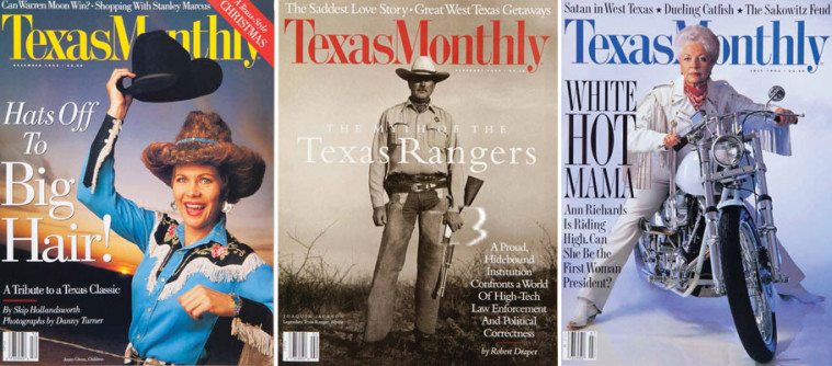
You may not know designer DJ Stout by name, but if you live in Texas, you know his work. His aesthetic has determined the past 30 years of visual Texana, both forward- and backward-looking, from William Wegman’s Weimaraners in cowboy boots to Ann Richards on a motorcycle in fringed white leather. As the art director of Texas Monthly from 1987 to 1999, he guided the magazine’s sensibility out of the big-hair era and into the 21st century. Since then, as the Austin partner of global design behemoth Pentagram, he’s continued to put his stamp on the state, with branding and design work for Lone Star institutions including Texas A&M, the Texas Book Festival and the Salt Lick barbecue restaurant.
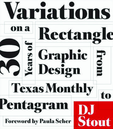
Now, he’s given us Variations on a Rectangle: 30 Years of Graphic Design from Texas Monthly to Pentagram, a 288-page visual primer on the highlights of his own career. The edition is coffee-table size, with 795 photos, but it’s not a conventional art book. Most of the book’s arresting images, and there are many, carry the bylines of prominent photographers or illustrators, not Stout. It’s natural at some point for readers not familiar with the ins and outs of magazines and design firms to wonder, as Stout’s father once asked, “If you don’t take the pictures and you don’t do the illustrations, what do you do?”

By DJ Stout
UNIVERSITY OF TEXAS PRESS
288 PAGES; $40.20 University of Texas Press
Stout’s reply to his father was simple and literal: “I do the layouts.” (The exchange is recounted in one of Variations on a Rectangle’s many folksy reminiscences — first-person text boxes and sidebars authored by Stout and peppered among the images to explain his work or offer lessons for wannabe designers.) Stout’s visual work is so attuned to multiple meanings and associations, however, that he probably wouldn’t object to our taking his verbal reply to his father as metaphor, too. Other artists might take or draw the pictures, but Stout maintains the master plan, doling out assignments and arranging the results on the page so that, by juxtaposition or evocative setting, a cumulative meaning is revealed.
“He knows how to make a point,” writes Paula Scher, another Pentagram partner, in her introduction, “and he also knows how to embellish the details along the way to create the right analogies and exaggerations to keep us eternally engaged. Editorial design is the art of storytelling, and DJ’s brand of it is uniquely American. Western American. It starts out slow and builds. It wins you with a bit of humility (almost ‘shucks-gee-whiz’) and then comes back at you with a surprise punch. The pacing and analogies feel like a Will Rogers narrative: guileless, optimistic, and pointed all at once.”
And just what point has Stout been making for the past three decades? It’s by no means monolithic. Particularly in the Pentagram work, it can vary wildly, from “L.L. Bean is not your father’s menswear catalogue” to “Rosebud Hydroponic Grower’s Magazine is for hip, upscale marijuana growers.” Some of Stout’s more mercenary work will be of interest solely to up-and-coming professional graphic designers. The Texas Monthly work, however, will hit home for anyone with ties to the state. In spread after spread, Variations on a Rectangle revisits his work for the magazine: a cover shot of a Texas Ranger with his gun; a quarter coin where the engraved George Washington wears a cowboy hat; a half-silhouette man on horseback galloping with a Texas flag. Stout refers many times in the book to The Myth, a concept he attributes to Texas Monthly’s collective “we”:
The kinds of subjects that fall into the Texas Myth category are things like Tex-Mex, wealthy oilmen, rattlesnakes, beauty queens, rednecks, football, chili, cheerleaders, barbecue, rodeo, Longhorns, margaritas, bull riders, guns, two-stepping, bluebonnets, sleazy politicians, roadrunners, bandanas, Big Red, fire ants, cactus, jalapeños, horny toads, gimme caps, barbed wire, Wrangler jeans, dance halls, big hair, prairie dogs, cowgirls and cowboys — and their hats. Of course, many of the subjects on my abbreviated list are hard to classify as “purely” Texan because obviously you can find most of those things elsewhere in the country. There are probably as many people in Montana wearing cowboy hats as there are in Texas, but Texas has appropriated the cowboy hat as its own. It’s our symbol, our logo. You could say it’s our “brand identity.” Whenever I need to make something identifiable as Texan, I just put a cowboy hat on it.
What Stout describes is a familiar conundrum to people who produce and comment on Texas culture. It’s so dang easy to make something look or sound Texan, but pulling again and again from that cheap bag of tricks can leave readers with a sort of empty-calorie gnawing in the stomach. On a highbrow level, at least, the solution seems obvious: Eschew all cowboy hats. In the pages of the Observer, as long ago as 1960, postmodernist Donald Barthelme eviscerated a kitschy architectural proposal for a museum in the shape of Texas, calling on aesthetic-minded Texans to leave behind that “lovely myth that enables us to avoid the arduous business of seeking out and experiencing The New.” Yet the fact is that much of daily life in Texas still does take place in the shadow of, if not a cowboy hat, then at least football, Big Oil, jalapeños, barbed wire, guns and sleazy politicians. The cultural Myth won’t die, because so many of its constituent elements live on in reality.

Stout is no highbrow, though he is his own type of cultural savant. He’s fluent in the reference points of the international art world, from Warhol to Wegman. He’s also endlessly curious about folk graphic styles, from the curly teenage handwriting of a girl who signed his high school yearbook (repurposed as a font to evoke innocence in a Texas Monthly story on a brutal rape) to the distinctive lettering of Mexican family Bibles (for a story on the trial of Selena’s murderer). Even back in the 1980s, Stout exhibited a 21st-century knack for repackaging elements of the past as flavors on an endless menu of design choices. If this custodian of layouts has a style of his own, it’s as a mash-up artist of Texas visual styles and emotional cues, tossing them at us just a bit too quickly and in too much variety for us to forget that it’s a Myth he’s toying with.
Stout’s Myth is an Eden, an optimistic, even patriotic version of a troubling history and current state of affairs. In Variations on a Rectangle, Stout recounts the story behind his cover for the 1994 article “The Twilight of the Texas Rangers”:
The minute the issue hit the newsstand, Texas Monthly was inundated by requests for the picture, so much so that I designed a poster featuring the image, which continued to sell briskly for many years. Ironically, [Robert] Draper’s piece told the story of how [Joaquin] Jackson had quit the Texas Rangers in disgust over the outfit’s politically correct hiring practices (basically, hiring women), which had been ushered in by Texas governor Ann Richards. That didn’t seem to matter, however. The power of the American cowboy image — The Myth — trumped the writing, and so the photograph ended up on the cover of the anniversary book and Jackson became the unofficial poster boy for the exhibition.
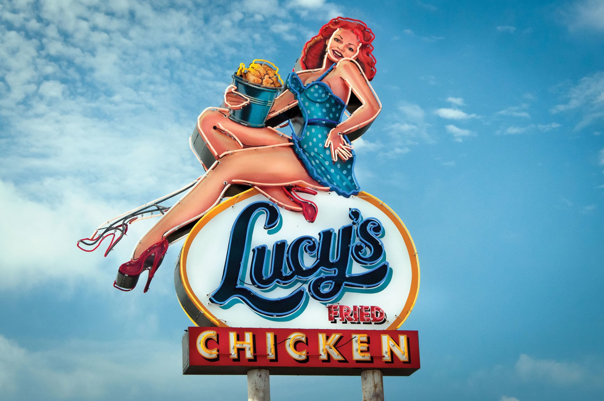
There are reasons beyond the aesthetic to feel uncomfortable with The Myth Stout is selling. On the other hand, there’s always the implication in Stout’s work that we can’t go home again, that the Myth lives just out of reach in some sunlit designer’s studio. “Anything that is meaningful, anything that resonates with an audience, comes from somewhere and usually from past experience and familiarity,” Stout writes. “It comes from deep, heartfelt memories and nostalgic longing for a time and place that meant something at one point but has slowly dissipated over time.” Flipping through his book might indeed lead to a gnawing in the stomach, first for the past, then for critical depth, and finally for barbecue or Lucy’s Fried Chicken (Stout designed the iconic Austin brand’s neon pinup girl).
It’s so dang easy to make something look or sound Texan, but pulling again and again from that cheap bag of tricks can leave readers with a sort of empty-calorie gnawing in the stomach.
Texas patriotism has its uses. It makes us determined to be the best. On that level alone, Stout’s energy is indispensable to the visual culture of our state, as we strive not merely to equal the designers of New York or Europe, but to advance our own vision befitting a “whole other country.” So Stout’s invitation to join Pentagram and run its sole Texas office means something for the state; he keeps us on the map. Ditto his 2010 fellowship from the American Institute of Graphic Arts for lifetime achievement. Hell, in 2006, Stout’s Pentagram office was even hired to redesign Yankee Magazine. That alone should make him a Texas hero.
“The ‘Stars and Stripes’ has too many of those,” Stout writes in one of his typically Texas-braggadocious critiques. “It’s busy — a classic design mistake — whereas the Lone Star flag captures the essence of American symbolism with one red and one white stripe and a single star in a blue field.” Stout is special, in the end, because he has the brass to make that argument: Maybe we really can do better.


